


SGG Special: A Style Survey of the NBA City Jerseys
The good, ok and complete wastes of fabric.

Hi friends and strangers,
It’s finally fall! There’s still a hint of humidity in the air (and my hair) but I couldn’t be happier. For many, it’s time to get back to school, but I’m so happy that sports are coming back and a new fashion cycle!
NYFW came and went with some fanfare - I was at home with some sort of COVID-esque flu that made me yearn for styled outfits besides sweats. There were exquisite accessories and styling on Long Island (Ralph Lauren in the Hamptons), Coach’s continued domination in the bag category (dino and bear bags with kiss locks!), and more. The main fashion event I wish I had scored an invite to is Bella Hadid’s horse girl party downtown - I can canter in all kinds of outfits, if that helps for next time, Bells!
As the NBA season approaches, the impending on-court uniform choices are starting to leak. Since Nike took over the uniform sponsorship beginning in the 2017-2018 season with an eight-year deal worth approximately a billion dollars, they’ve been releasing “City Edition Jerseys” every season. The specialized jerseys are supposed to celebrate the heritage, spirit and style of each team’s home and while originally the novelty made the melee around the jerseys - it’s starting to feel like more of a cash grab than a spirtied city ode. And yes, we all know that Nike is run by its shareholders (so much so that they ran the last CEO out of town for executing their plan of Walmart-ification that they wanted but I digress…) - but it would be nice to see more actual effort put into these pieces. At the very least, it does give me something to complain about online so thanks for the content, I guess?
Since writing an in-depth review of every jersey will have me writing “jersey” so many times I may turn into a Stephen King character by way of an all-time Simpsons Halloween special - I’ve divided all thirty jerseys into specific categories. Because all mediocre design and no inspiration make Megan go, something something - let’s begin!
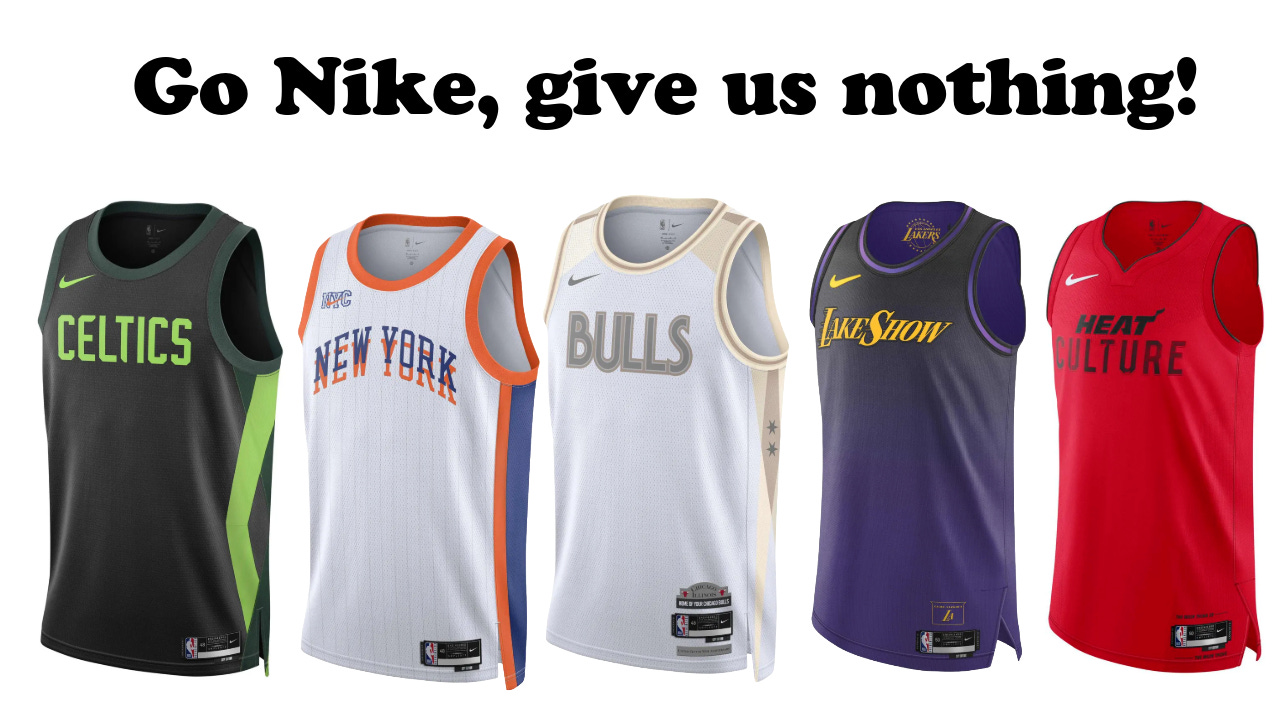
Go Nike, give us nothing! - Boston Celtics, New York Knicks, Chicago Bulls, Los Angeles Lakers, Miami Heat
Simple can be good. However, the City Edition designers of these franchises seem to think that they were making free swingman jerseys to give away for free for fans - because honestly - what else would be the reason?!?
Did the Boston Celtics forget that the Nike volt green has nothing to do their team branding or that they are returning this season as the champions? Why do the jerseys look like pinneys for an underfunded kids’ league in surburbia?
Is the New York Knicks jersey a tribute to the fact that NYC is “the city so nice they named it twice” - but did the most basic interpreation of it all? Why are the pinstripes so faint that you’d need Spike Lee seats to see them?
Why are the Chicago Bulls gold - a team that is synmous of the color red, yet it only appears on the the tag? Apparently it’s supposed to reference the anniversary of the United Center where they play, and the colors represent the infamous Michael Jordan statute - which feels like they designed the jersey first, then made up the story to fit (product before the brief). Why no reference to Chicago city flag, or even you know - the acutal typography the brand uses? Are they trying to copy most tech and high fashion brands and that the spirit out of their font?
The Los Angeles Lakers jersey is just some throwaway summer league piece that wouldn’t even make it as a videogame avatar option - LakeShow? I get it, but maybe if you weren’t fighting the Wining Time show so hard (RIP, great show - someone please pick it up so it can live on beyond HBO MAX) it would hit different. The tonal color shift is interesting but won’t pick up well on camera and just feels like they opted for safe and boring instead of working with the archival history of the Lakers.
The Miami Heat on the other hand - instead of acutally designing something that brings in elements of vibrant, multiculturual and aura of Miami - they just wrote culture on the front with weird spacing and font size choices. It’s an insult to actual Miami culture, truly.
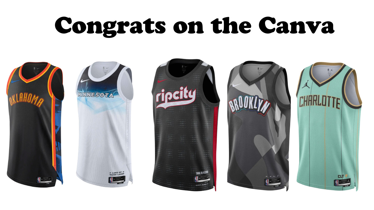
Congrats on the Canva - Oklahoma City Thunder, Minnesota Timberwolves, Portland Trailblazers, Brooklyn Nets, Charlotte Hornets
This category is dedicated to brands that looked like they put in a pinch of effort and a lot of “well I already loaded these art elements into my Canva so let’s just layer things differently this time” - lazy, predictable, forgettable. These are not jerseys anyone will care about for long periods. The Oklahoma City Thunder has arguably one of the most fashion-forward teams in the league (yes, I know - Oklahoma City! Proof that boring taste is a skill level) but these are a snooze. I’m not a big fan of the subtle v-neck in general on basically jerseys and I dislike how the orange lines on the side do not flow into each other - they just put some elements from last year’s jersey together and called it a day.
The Minnesota Timberwolves on the other hand tried to get the tiniest font possible for their state name across the chest and some sort of weird, vaguely icy-inspired graphic behind it - perhaps for all the lakes? An almost all-white jersey is a choice, especially in a place that has a rich color palette and I wish they went to some cool retro graphics to inspire their design story. I’m really curious to see how the jerseys look with shorts and the numbers will surely dwarf the “Minnesota” font.
The Portland Trail Blazers play a short drive from the Nike world campus - and the city is home to some of the best creatives in the sports world - and yet - didn’t they wear this jersey before? There is no nod to the Nike ingenuity, the Rose City or even a sprinkling of the Jail Blazers era swagger. The background of the jerseys won’t read well when on camera and honestly, they seem like a waste of fabric.
The Brooklyn Nets once again went to the Kaws well, who has a giant statute in the lobby of the nearby Brooklyn Museum and other work around the city. While it’s nice to see an artist get such a platform, much like the Nets’ recent seasons - it’s a bit of a mess, but at least looks better than last season’s attempt. The print would look cooler scaled down and on the shorts - maybe on the side panel - and the Brooklyn color choices around the font make it seem like the jersey is one that Kaws could sell himself - but doesn’t reflect the team at all.
The Charlotte Hornets are trying to recapture some of the original Hornets’ panache with pinstripes and aqua - but the color is different from their current palette and it just seems a little divided from their purple and teal push. Gone is “Buzz City”, for now it’s just Charlotte and the Jordan logo - okay, sure.
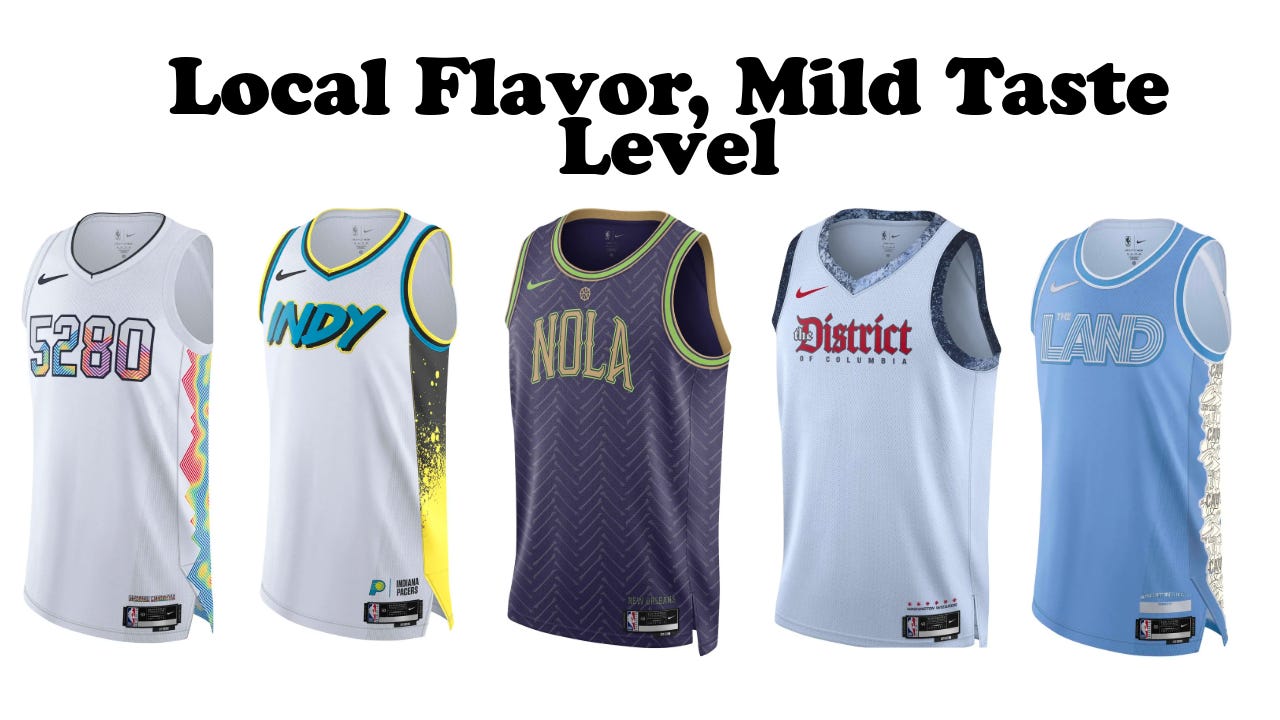
Local Flavor, Mild Taste Level - Denver Nuggets, Indiana Pacers, New Orleans Pelicans, Washington Wizards, Cleveland Cavaliers
These team jerseys specifically played to their local flavor, harnessing their city’s special elements. While the actual designs aren’t groundbreaking, I feel like they could sell well and bring hometown excitement. The Denver Nuggets and their city jersey is a perfect example of this summation. For example, many of us outside of Denver, know about the 5280 signficiance across the front of the jersey? Those four numbers stand for Mile High - aka 5280 feet above sea level. 5280 is a very popular naming element for Denver businesses and events (magazines, stores, etc.), and while it is a bold move to not even include Denver or the Nuggets on the front of the jersey - it is a bit of a fan service that works as locals are excited. I’m curious to see how the topographical elements seen on the side and back work on the shorts.
The Indiana Pacers and their hometown of Indianapolis is infamous for the eponymous Indy 500 at the Brickyard in an actual town called Speedway, Indiana (a suburb of Indianapolis). That seems to be the main explanation for the very retro by way of racetrack styling of the jersey, but apparently - it’s supposed to reference all the street art around the Midwest city. Sure, I guess? The aqua and shade of yellow used are very different from the more muted yellow, navy, black and white of the Pacers’ usual uniforms but the graphic does pop and I can see it being very popular amongst kids and racing fans alike. I wonder if we’ll see checkered flag or milk elements on the rest of the uniform?
I have gotten in trouble for skewering the New Orleans Pelicans uniforms in the past, given that the colors of Mardi Gras can be challenging to put into sports merchandise styling. Are these jerseys perfect? No, but the large NOLA type, tonal background and pops of green on a purple jersey make it one of the easier New Orleans jerseys in recent years - last year they left very Frankenstein and not Voodoo cool. It would be nice if they pushed it farther, but I think it does seem to connect with the city without overwhelming it.
The Washington Wizards jersey at first glance seemed like something out of a video game, but some elements are harder to see, like their signature three stars on the side of the uniforms, the use of actual team colors - red, white, black, navy - and a different take on their statement edition jersey name - “The District”. The font is different from the main Wizards’ style guide but at least it’s legible and interesting.
Anytime I see the Cleveland Cavaliers wearing baby blue, I get a little nostalgic for the 90’s Cavs logo. “The Land” is another locals’ nickname for Cleveland that the team has been using with varying degrees of success over the past few seasons for alternate and statement uniforms. On the side panel, there are different sketch-inspired wordmarks of various Cavaliers branding throughout the years. It won’t be impactful on the court, but I can see it being a special collector item for locals.
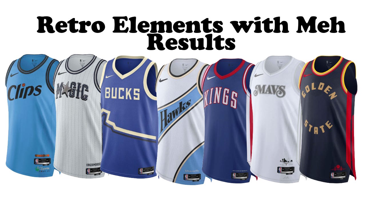
Retro Elements with Meh Results - Los Angeles Clippers, Orlando Magic, Milwaukee Bucks, Atlanta Hawks, Sacramento Kings, Dallas Mavericks, Golden State Warriors
This section is a bit of a mixed bag of design elements that look like they come from various eras but are not always well executed. It is interesting how many of them are different shades of blue though. Starting us off is the Los Angeles Clippers, who recently did a rebrand that focuses more on the stylistic elements unique to the Clippers’ previous home of San Diego, using the clipper ship and compass as the main anchor of their design shake-up. Most of the colors stayed in the same vein though, shifting a bit tonally including this more saturated powder blue. For this season’s city edition, they used the new color scheme to update last year’s jersey which referenced LA artist Jonas Woods. If it ain’t broke - just recolor it.
The Orlando Magic are getting a bit better at leaning into their big logo, 90’s era style heyday yet again with these city jerseys, featuring a big Magic logo that includes the retro style “A” star and textured pinstripe background that won’t read on TV but adds some cool detail in hand.
The Milwaukee Bucks are paying homage to their natural surroundings with another “Great Lakes Blue” jersey design, with the stripes representing the coast and rivers, I think? It’s fine, local but basic. The font seems like it’s trying to be retro but comes off as unresolved.
The Atlanta Hawks are eschewing their usual team colors again this year for their city jersey and instead, borrowing the palette from the team’s previous home in St. Louis. The arched elements and colorblocking are inspired by different Hawks’ jerseys from years past making a decent attempt at mixing history with current jersey styling. I think these could be a sleeper hit and would like to the layout on other Hawks pieces in the future.
The Sacramento Kings also went for a throwback style, referencing Cincinnati Royals with very clean styling, simple font and a red, white and blue colorway that looks more in keeping with the Wizards than the Kings - but at least it’s wearable and comes with some cool history.
Did the Dallas Mavericks run out of color this season? Is it silver because they came in second place last season, or are they just so tired of all the blue? There’s some cool detailing on the side panels that seems to work well with the Mavs script logo (which is a bit small) - it makes me wonder how big the numbers will be and in what color? It’s a very ghostly effect and perhaps they’ll bring in metallic thread to make it pop more. Stylistically interesting, but seems unfinished.
The Golden State Warriors are apparently playing homage to the Golden Gate bridge, with the red side panels and blocky lettering. It is weird to see tan as the main font color for a team that is golden, but perhaps it will look more gold when they are finally released IRL. It’s blocky, it’s fine - it looks like it’s trying to emulate the strenth of the bridge - but just seems a bit disjointed at the moment - perhaps the shorts will help tie it together.
The Script Saves It - Memphis Grizzlies, Houston Rockets, Philadelphia 76ers, San Antonio Spurs, Detroit Pistons
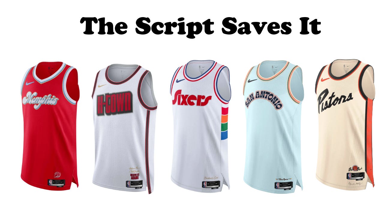
A good font can fix almost any jersey, and these five pieces are all being elevated thanks to just the choice of typography. Starting with the Memphis Grizzlies, who in related news, is bringing back one of my favorite throwback uniforms and color palette combination - the original Vancouver Grizzlies set this year. Hallelujah! For the city edition jerseys, the Grizzlies paid tribute to the ABA Memphis Sounds team, combining elements from the Sounds’ uniforms - like the font and red color - with the current baby blue of the Grizzlies. These will look great on TV and do a great job of mixing retro with current styling.
The Houston Rockets recently introduced the new H-Town font, along with a little astronaut alternate logo - and honestly - I kind of love it. It’s fun, plays on local lore with the space program and looks new but not over-designed. These uniforms pay home to Clyde Drexler and Hakeem Olajuwon and their back to back to titles with their names embroidered and a swoosh in gold. It’s fun, punchy, and will look great with their new court.
The Philadelphia 76ers brought back their classicly cool Sixers font with the Spectrum-style “S” - their previous home - and features four colors to reference all four Philadelphia area sports teams - Sixers, Eagles, Phillies and Flyers. It’s simple, effective and local - everything a city jersey should aim to be. The red and blue piping keeps it both current and classic.
The San Antonio Spurs are not a team known for their flourish or style but for their great defence and high calibre of teams. While they’re still rebuilding around the great young star Victor Wembanyama, the Spurs took a little risk for the second year in a row with their City jerseys. Like last season, they took reference from the 1968 World’s Fair in both font, which looks stencil-inspired like signs of old (although it still looks more modern than hand-drawn) and very 60’s and 70’s style color choices with a light aqua body with brown, peach, orange and white accents. It’s a unique look that whole I’m not sold on the color choice - the font is a lot of fun and quite a departure from the dependable team.
The Detroit Pistons didn’t go back to the Grant Hill-era aqua uniforms but instead, went for a less obvious, but arguably cooler reference point. The main font is inspired by the original Bad Boys shirts that originally were massive when the team won back-to-back championships. At first I didn’t love the diagonal, but I think if they put the numbers in the same font as “Detroit” from the shirts, it would be a very cool, clean look that along with the color blocking is equal parts modern and retro but very 2024.
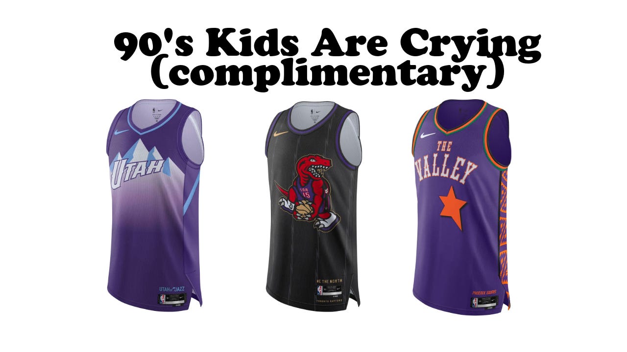
90’s Kids Are Crying (complimentary) - Utah Jazz, Toronto Raptors, Phoenix Suns
Finally, we get to my top three, which if I’m being honest - are mostly the top three because of millennial nostalgia. You’ll notice that all three have a good mix of retro elements, modern styling and COLOR. PLEASE, less white!
The Utah Jazz showed off their redesign to much fervour this summer that will see a variety of uniforms rolled out over the next year two seasons. I love the arching, strong UTAH font, which leaves room for numbers that will fit in nicely with the ombre color effect of the mountains. Of all the uniforms shown, this is one of my favorites from the “Mountain Basketball” design story. While the Jazz name certainly doesn’t make much sense in Utah anymore - the uniforms now at least reference their home state and will look great on camera and in person.
The Phoenix Suns will always have a soft spot in the millennial-age sports fan thanks to the elements used for the classic NBA All-Star uniforms, at the height of the giant logo era. I also elements from the recent WNBA All-Star branding with the use of stars and the color palette. The Indigenous-art-inspired side panels and western font are a lot in one jersey - I think The Valley font is a bit too big leaving it a bit crowded, but it makes sense to go big when they’re referencing a specific oversized lettering and logo era.
Finally, we get to the Toronto Raptors. I remember when radio stations were holding contests to name the team, and as a Jurassic Park-obsessed youth I loved the team name! I should be equally obsessed with these uniforms - but I am merely whelmed - not over or under but just…fine? Today, the Raptors finally announced Vince Carter’s jesrey retirement, hoisting his #15 era jersey all over the city, and dedicating courts in his honor. I love VC and nothing will ever top the dunk contest. But I have to wonder - why is it not purple? Why is the Raptor off-center? Why is there no red on the Raptor’s feet to signify the infamous And1 sneakers? It just seems rushed. I understand that they wanted a black jersey perhaps to harken back to the black jersey VC wore, but I’m not sold. I know I need to see them in person and with the shorts to get the full experience - but as someone who cried when both McGrady and VC left - I just want the best for my faves! At least, thankfully - they’ll retire his jersey this fall, well before the Nets.
So, there we have it - all 30 teams and many opinions. Do you have a favorite from the City edition jerseys, are they even needed when we have a home, away, alternate and statement options? Is Nike running out of ideas and is it time to tighten things up instead of designing mid-variants?
Let me know what you think. I’ll be back ASAP since apparently the NHL is making style waves in a plot twist I’ve been waiting for since I was a six-year-old watching Coach’s Corner.
Stay safe and stay true,